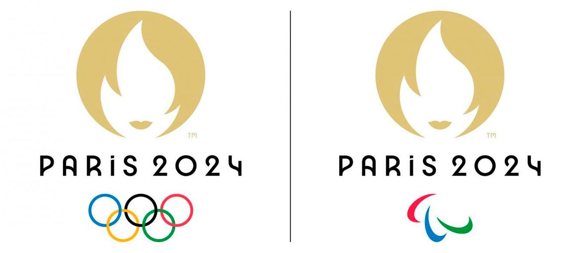
As the world enjoys the Paris Olympics, a significant amount of conversation was generated by the unveiling of its logo. At the heart of the logo is Marianne, a figure deeply rooted in French identity. Let's delve into who Marianne is and how the public has responded to this emblematic choice.
Who is Marianne?
For those unfamiliar with who Marianne is, she is an allegorical national symbol of the French Republic. As an allegory, Marianne is not a historical or real individual but rather a symbolic representation, embodying liberty, equality and fraternity. Marianne's image has been used throughout French history to represent the values of the nation. She appears in various forms, from statues and paintings to everyday items like postage stamps and coins. Often depicted wearing a Phrygian cap, a symbol of freedom during the French Revolution, Marianne is a powerful icon of the nation's revolutionary spirit and its ongoing commitment to democratic principles.
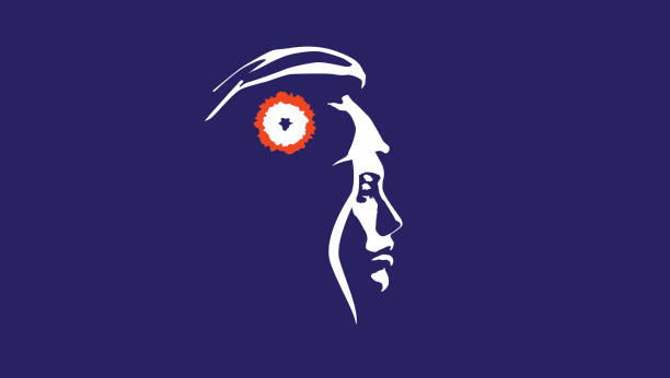
Public Reaction: A Mix of Praise and Criticism
The response to the Paris 2024 logo has been varied, reflecting a spectrum of public opinion.
On the positive side, some have praised the logo for its meaningful symbolism. Supporters argue that incorporating Marianne into the Olympic logo is a brilliant way to celebrate French heritage on a global stage. It is seen as a design that respects tradition while embracing contemporary aesthetics, aligning perfectly with the spirit of the Olympics.
However, the logo has not been without its critics. Some have voiced concerns that the design is overly simplistic and lacks the dynamism you would expect from an Olympic emblem. There have also been debates over the decision to use Marianne, with some feeling that it may not resonate universally with an international audience, who may be unfamiliar with the symbol's significance.
A key response from critics highlights its uncanny resemblance to the logo of the dating app Tinder, even likening it to branding from a hairdressing salon. Many have expressed disappointment, arguing that the emblem’s minimalist design and the stylised depiction of Marianne are too close a resemblance to commercial logos rather than capturing the unique look expected of an Olympic symbol. This perceived lack of originality has led some to question whether the logo effectively represents the prestige of the games or merely looks like another trendy brand.

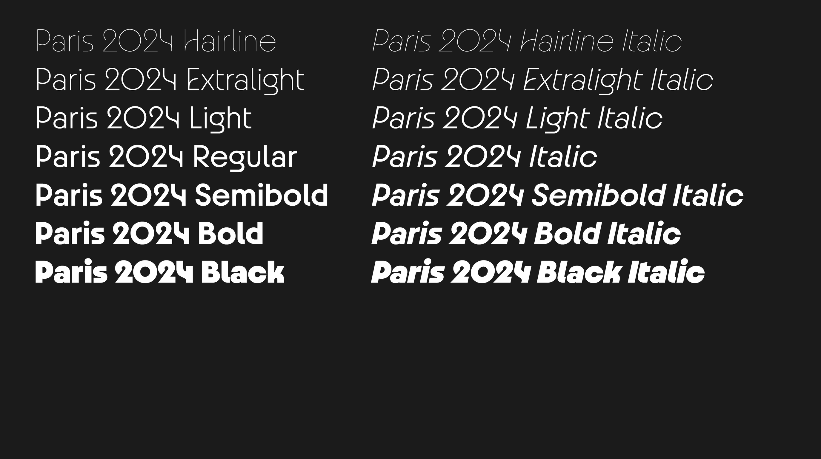
Typography worthy of the old Olympians
However, amidst the criticism, there is one aspect of the visual identity that has garnered positive attention: the typography. The typeface chosen for Paris 2024 is both elegant and modern, giving a sense of sophistication that aligns beautifully with the cultural heritage of Paris.
The font's sleek and stylish design captures the essence of Art Deco, a style that holds significant historical and cultural value for Paris. It strikes a perfect balance between readability and aesthetic appeal, adding a touch of refinement to the overall branding. The typography manages to convey the spirit of the event and the charm of the host city, proving that even in a controversial design, there can be elements that shine.
In conclusion, the Paris 2024 logo is a masterstroke in some eyes and a misstep in others; but whether this was altogether a hit or miss in our eyes: we would go with a miss. As we inch closer to the end of the games, it will be interesting to see how this emblem grows on the international community and whether it ultimately stands the test of time.
