We’ve created a handy guide to help you work out if your website is ready to generate leads. See if you can go through and tick off all 10.
1. Several Routes to Contact
Has your website got different routes for customers to contact you on? A phone number, email address, email contact form, call back request form and even a live chat box? Different customers want different ways of communicating so it’s beneficial to add several ways to contact a business online.
2. Local Presence
It’s beneficial to show the key locations you operate in throughout your site. Making this clear shows people that you can service their area. Also, adding in your locations can also improve SEO performance, but be careful not to add too many locations into your copy! Does your site target your key locations?
3. Qualified Business
Adding accreditations, insurance and licenses to your site builds trust with the user. Having accreditation and licence logos clearly displayed makes it easier for visitors to recognise that you are a qualified company. Can visitors clearly see your accreditations?
4. Reviews
Online reviews are valuable for converting customers. Google My Business reviews can help a site to rank and stand out from competition. Reviews are a huge influence on customers; 93% of people have said that online reviews affect their buying decision.
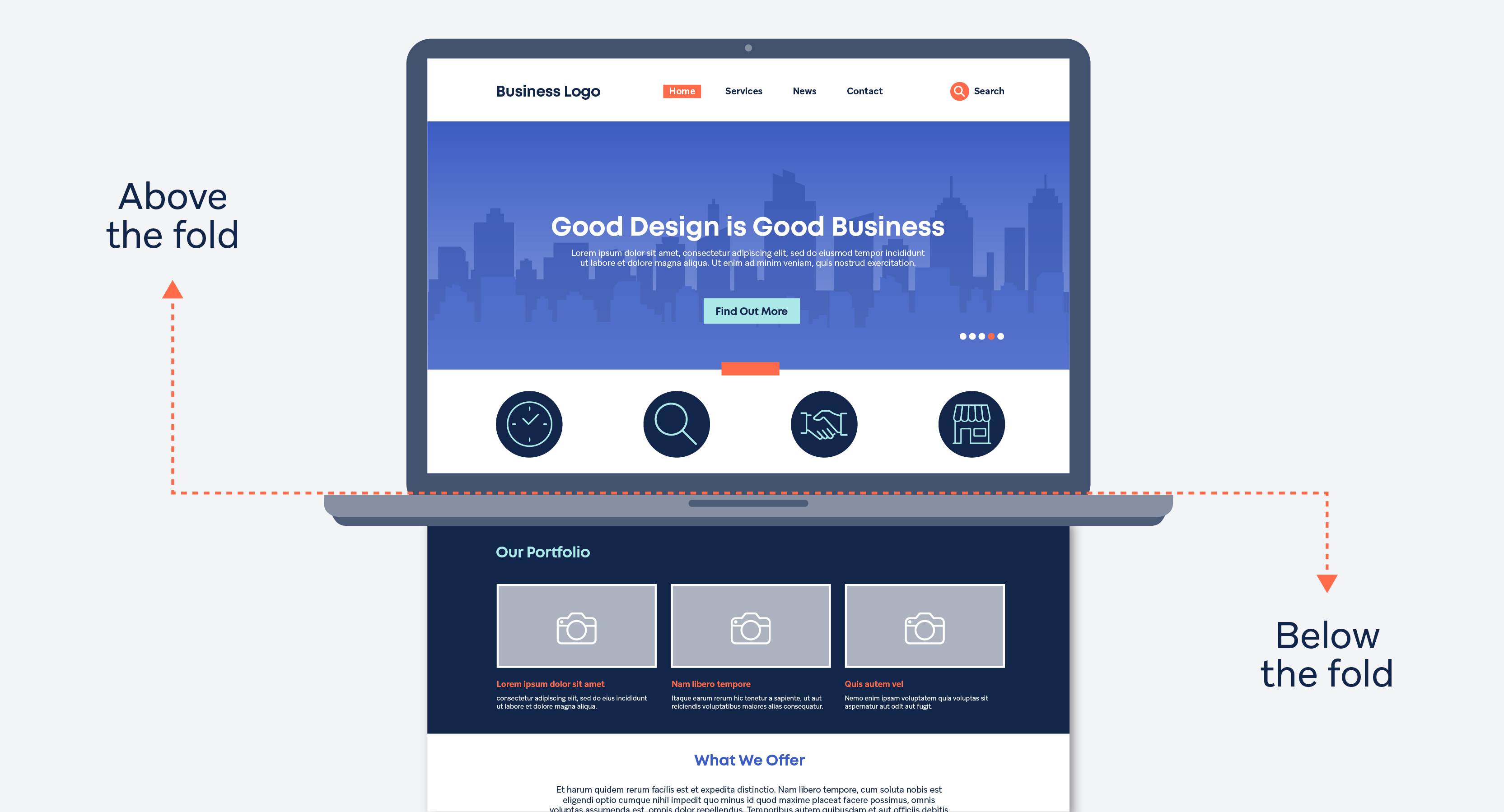
5. Above the Fold
The term ‘above the fold’ means what a site looks like before you scroll down. Have a look at your website and see if all the key information is viewable as a visitor lands on your page. Do you think people can understand your business when the website is ‘above the fold’?

6. Clear Structure
A site should only have 2-3 actions you want users to take. More than this and the user can become frustrated or confused. Has your site got 2-3 aims that you want to achieve? Maybe you want people to call your head office, download the company brochure, or fill in a quick quote form.
7. Photography
Images play an important role in the visual appeal of a website. High-quality photography provides a modern and professional look. Tailored photography can give a website a more professional and individual appearance. This in turn builds trust and confidence to potential clients.
8. USPs on your Site
Unique Selling Points (USPs) are fundamental when building a site. They provide reasons why people should use you instead of your competition. Think of what makes you different to the competitors operating in your area; are you less expensive? Are you more experienced? Do you work faster? Add your USPs to your site and make sure they’re clearly visible. Does your website have USPs that are clear to see?
9. Call to Actions
You want visitors to turn into conversions for your business, so make any Calls to Action (CTAs) clear. Make it easy for people to find the number or click on the contact page. Have reasons next to your phone number or contact form to let them know why they should contact you. Can visitors see your CTAs?
10. Contact Details
Are your contact details easy to find? There’s no point creating a site for attracting leads and then making it difficult for users to find key contact details. Ideally, you want to put the business address and number at the footer of the page; this is so it’s featured on every single page. If you are a business wanting the phone to ring, we would recommend having the phone number top right and adding your business address and number above the fold on the contact page.
How many did you get?
If you didn’t get 10 out of 10 then maybe it’s time to look at improving your website.
Adtrak specialise in generating leads for businesses; we combine carefully-strategised marketing with performance-driven website design to help our clients increase their lead generation and enjoy real, visible growth. From SEO to paid marketing, branding and content, we’ll provide you with everything you need to take your company to the next level. Contact us today to see how we can help you move forward.
