On 03/02/20, we officially launched the new Adtrak brand! We, of course, absolutely love it. Not only does it look pretty amazing, but it will also help us to achieve the ambitious growth we’re aiming for this year.
There are countless reasons you (our customers, industry peers, and the curious) should love our new brand too. Here are five of them...
It’s Simple
The new Adtrak brand is based on simplicity. It’s both simple for our designers to use and simple for our customers to understand. As a result, we have introduced a more streamlined colour palette and rely on striking core elements, rather than unnecessary flourishes. When designing anything in the Adtrak brand, we ask ourselves if what we’re doing adds value. If it doesn’t, then why would we do it?

It’s Blue
As part of the rebrand, we’ve reimagined our colour palette and our brand now consists of just four colours (three of which are blue), plus white. Although we’re not quite ready to wave goodbye to our signature orange, we are using a slightly different orange and it is no longer our primary brand colour. Instead, the blues are dynamic and vibrant and really help to tell our brand story.

It’s Digital
We’re a digital marketing agency, with a focus on performance-driven strategies and quality lead generation. Our new brand is reflective of our service offering and has been specifically designed to work best when used digitally. This will allow us to promote our services and use digital channels more effectively.
It’s Versatile
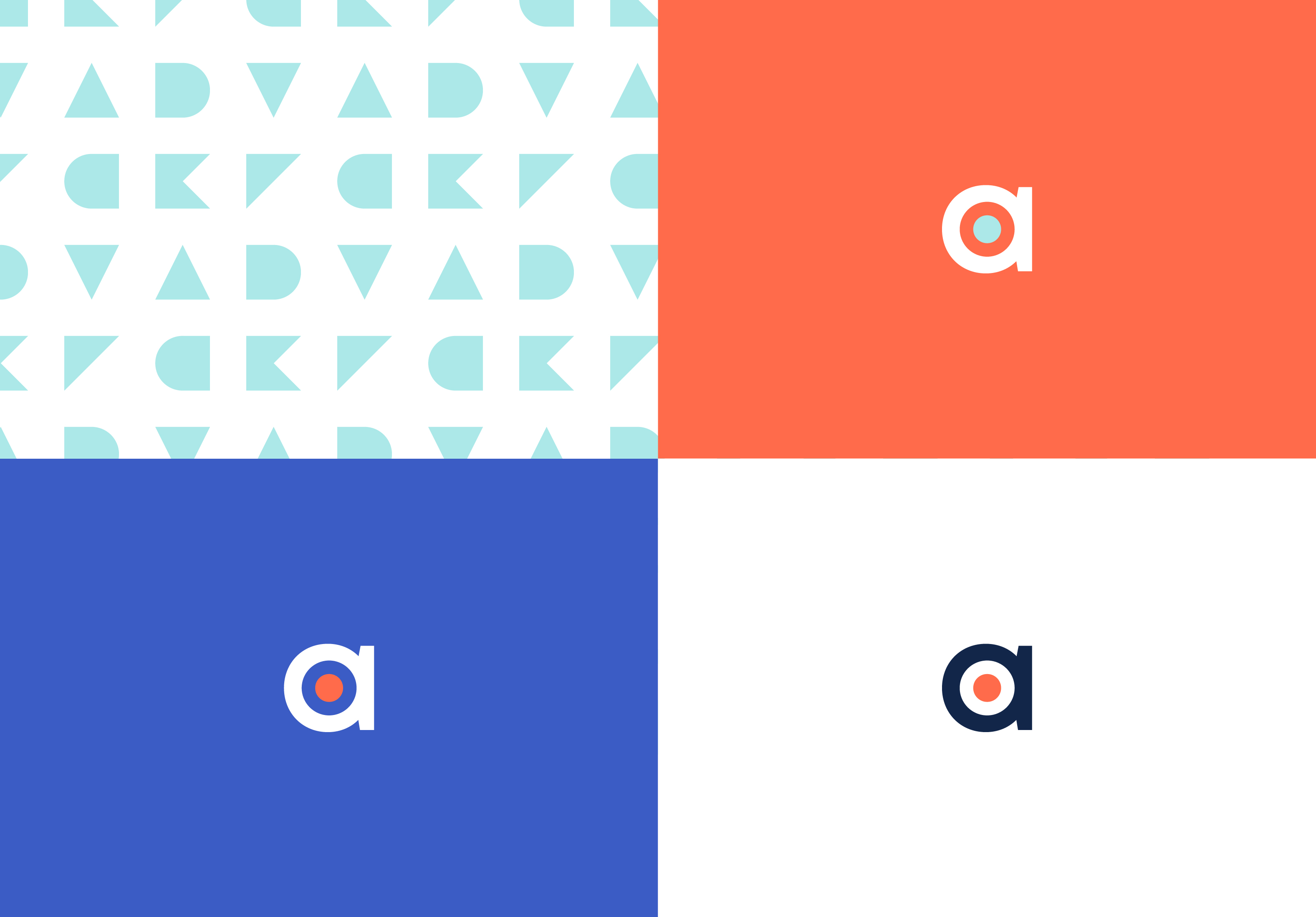
We wanted our brand to be suitable for multiple uses - from on our website and social channels, through to marketing collateral and communication campaigns. As such, we’ve made it incredibly versatile. For example, there are colour variations available for the logo, all suitable for use in different applications and on different coloured backgrounds.
We have also introduced a set of Adtrak shapes, which each represent a letterform of the word ‘Adtrak’. These shapes are designed to be flexible and can be used as a pattern, in isolation or to anchor images.
It’s Responsible
The new Adtrak brand is fresh and bright, with colours chosen specifically for digital use. We’re a responsible, modern digital agency with a commitment to design more for screens and less for print. We want to avoid as much printing as possible, only doing so when absolutely necessary, and our new brand guidelines stipulate this commitment.
