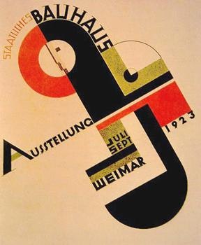
As I write this, I’m a bit excited. Not just because I went to see the Avengers movie the other night, but because one of the biggest influences on my design work (and yours, even if you only barely recognise the name – trust me) is the focus of a new landmark exhibition at the Barbican in Central London – The Bauhaus.

I’m going to try and steer clear of treating this like a very dry history lesson with facts and dates to memorise (although there will inevitably be a little bit of that).
Instead, I’ll keep it short and concentrate on the fun parts – why they were so awesome, the influence of their work, and how it can help you become a better designer.
Fanboy Mode: Activated
I genuinely cannot stress the importance of the Bauhaus and just how Goddamn GOOD they were.
Almost anything that you see in the world that you consider to have that classically modern look – whether architecture, graphic design, fashion; even websites, apps and digital media – almost certainly had its roots in these small art schools in Dessau and Berlin which existed between the wars and shouted so loudly that you can still hear their voice today.
So Why Were They So Damn Great
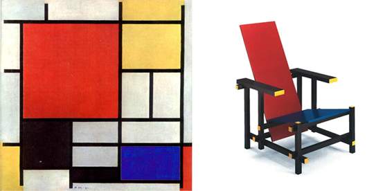
The Bauhaus sought to combine art, craft, and technology to reach a common goal and a common vision of a purer form of design without unnecessary decoration. Practical, functional, clean. We know it as modernism today, but at the time it wasn’t really, truly, a ‘thing’ just then. It was a collection of ideas, mainly from the Russian and Swiss schools of the time.
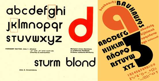
Wassily Kandinsky wrote extensively about composition – how objects relate to one another on the page, and how to guide the viewer’s eye. Paul Klee’s entire career was virtually an exploration in colour theory – how the use of a colour can provoke an instant, desired reaction in a viewer’s mind, and how that can change their perception of what is presented to them. Herbert Bayer broke down typography into as few geometric shapes as possible, paving the way for ‘Grotesk’ fonts to become accepted as the more standardised Sans-Serifs that we all know and overuse.
These are the principal visual building blocks for our industry, people! The Bauhaus had an incredible knack for taking new and creative ideas and distilling them into a system of principles. Their work helped put down the foundations for the modern grid system and create rhythm throughout design, a rhythm that’s still being tapped out on designers’ desks the world over.
So What Can I Learn?
Don’t Be Limited To Inspiration From Your Own Field
The school taught in virtually every major form of art and design, and ideas and principles between the different disciplines were passed around as freely as the ‘funny-smelling cigarettes’ were in the art colleges of the 1960s. Print designers looked at the draftsmanship of the architects; fine artists looked to the form and geometric shapes of the typographers; photographers sought advice form sculptors; it was an exchange of ideas with the idea that everyone was building towards a common goal.

And this is something that can often get lost when working in a commercial environment. It’s very easy to look at the brief of a website for a service-based company and only seek out inspiration from the websites of other service-based companies. I do it myself all the time.
What you can learn from the Bauhaus is to broaden your horizons, look for inspiration in the world around you. Magazine adverts, a store front, the side profile of a car in the street, the opening credits to a film – there are theories and principles all around us and it’s up to us to take a step back once in a while and see if any of them are applicable.
You work in an agency? Go and see what the marketing guys are up to. If you’re a web designer, see what the print and packaging people are working on. You might see something that has absolutely no connection to the job you’re working on but it might set you off on a different trail of thought which leads to a great outcome for your project.
Form Follows Function
The first thing to think of when starting a project is what does this NEED? Look at the purpose being served by the work you are creating, assess what it requires to perform to the desired level, and design appropriately. This can come off as pragmatic and un-fun, that all design needs to be clean and without flourish or flare. That couldn’t be further away from what I mean.
Some visual flourish can greatly enhance a design and make it stand out and be exactly what the design needs; what I mean is decide whether it needs it or not – don’t withhold yourself from going to town on making an impact with the piece, but at the same time don’t add unnecessary fluff if it doesn’t aide the function of the work. Keep it as complex or as simple as it needs to be.
Embrace Your Design System, And Learn To Control It
The transition from Design College to the working world is fraught with pitfalls and traps. You have to actually wear pants in the afternoon when you work, for one. And you can’t stop work to have an in-depth discussion on the precise amount of drugs the creators of Yo Gabba Gabba must’ve been on.

But the biggest must be the idea of applying yourself to a design system. When you begin working/training in the field of design, the idea of using a grid system (for example) can seem constrictive, oppressive, and well, it’ll not allow me to, like express myself, man.
But once you begin to learn something like a grid system, you quickly see how it’s actually really beneficial and that you’re not controlled by the system, the system’s controlled by you (to an extent). You can’t break rules without learning and adhering to the rules in the first place.
Bringing The Haus Down

Like with so many things, the Bauhaus couldn’t escape the hands of the Nazis. Seen as a centre of ‘degenerative’ thought and socialist sympathy, the school was forcefully closed almost the second the Nazis assumed power in 1933. Many of the more acknowledged students and teachers – Walter Gropius, Marcel Breuer, László Moholy-Nagy – moved to London and the United States to become eminent professors, tutors, and scholars in their various fields. Wassily Kandinsky and Paul Klee went on to be regarded as two of the most important artists of the 20th Century, and their draftwork laid the foundation for much of modern Graphic Design theory. The work and the idea of the Bauhaus spread far and wide and is now as ubiquitous as an Instagram filter applied to a picture of a cat, or any fine art movement you care to mention.
So That Exhibition, Then


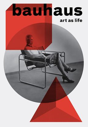
The ‘Bauhaus: Art As Life’ exhibition runs at the Barbican Art Gallery until the 12thAugust, and I urge anyone who is reading this and happens to be passing through London before then to check it out.
I tried to deliberately keep this to a relatively digestible length, so there’s a lot of simplification and vast swathes of finer details missing up there. But if you want to read more about the Bauhaus, then see if these links inspire you further:
